The company runs a financial advisory practice in Bangalore. Three advisors, a clean website, decent content marketing, and a Google Ads campaign that had been running for eight months. Monthly traffic: around 3,000 visitors, consistently. Monthly enquiries: two. Sometimes three. Never more than four.
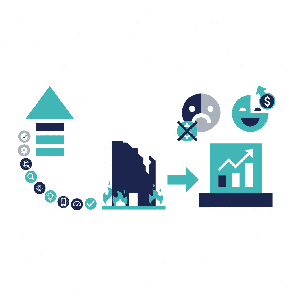
They came to us convinced they needed more traffic. More Google Ads spend. Better SEO. More blog posts.
We asked to see the website before talking about traffic.
What we found in the first five minutes
The homepage was well-designed. Professional photography, clear service descriptions, credible team bios. Everything a financial advisory firm should have.
The call to action was a button in the top navigation bar that said "Contact."
That was it. One button, top right corner, one word. No CTA on the homepage body. No CTA at the bottom of the service descriptions. No CTA at the end of the blog posts. Visitors who read the whole homepage and wanted to reach out had to remember there was a button in the corner they'd noticed when they arrived.
Of 3,000 monthly visitors, the people who noticed the navigation button and decided on their own initiative to click it: two or three per month. That's a roughly 0.08% conversion rate. Not a traffic problem. A navigation problem.
The 90-minute change
We made three edits to the homepage, none of which required a developer:
One: Added a section midway down the homepage, after the service descriptions, with a headline: "Not sure which service fits your situation? Talk to us for free." Below it, a button: "Book a 30-minute consultation."
Two: Added the same button at the bottom of the homepage, above the footer.
Three: Changed the navigation button from "Contact" to "Book a Free Call."
Total time to make the changes in their CMS: about 40 minutes. The remaining 50 minutes was writing the copy for the new section.
What happened in the following two weeks
Week one: six enquiries. Week two: nine enquiries. Month one average: eight per month.
From two to eight. Same traffic, same targeting, same content. The only change was that the website stopped making interested visitors do the work of finding where to reach out.
Why this happens on so many professional services sites
The people who build professional services websites are usually focused on making the site look credible. They succeed at that. What they often under-invest in is making the site persuasive — not in a sales-y way, but in the sense of actively guiding a genuinely interested visitor to the next step.
A visitor who lands on your homepage, reads your services, thinks "this might be right for us," scrolls to the bottom, and finds nothing but a footer has been abandoned at the finish line. They may come back later. More likely they search again, find a competitor, and that competitor has a prominent "Book a call" button.
The homepage is not a brochure. It's a conversation. And like any conversation, it needs to invite a reply.
Frequently asked questions
What conversion rate should a service business website aim for?
For professional services, converting 2% to 5% of visitors into enquiries is the target. Below 1% means there's a fundamental problem with messaging, trust signals, or the call to action. A business with 3,000 monthly visitors and a 3% conversion rate generates 90 leads per month.
How quickly can a conversion rate improvement take effect?
Within days of publishing the change, for changes that affect the homepage CTA and above-the-fold content. The new version is seen by every new visitor immediately. You'll have meaningful data within 2 to 4 weeks depending on traffic volume.
Do I need a developer to improve my website's conversion rate?
For many common fixes — changing button text, simplifying the homepage headline, moving the CTA above the fold, adding a testimonial — no. These are content changes that most CMS platforms allow without code. Developer involvement is needed for structural or design changes.
What is the single highest-impact thing most service websites get wrong?
The call to action is too vague or too buried. 'Contact Us' as the only CTA, placed in the navigation bar only, with no on-page prompt, loses most of the visitors who would otherwise enquire. A specific, action-oriented CTA ('Book a free 30-minute consultation') placed prominently on the homepage typically doubles enquiry rates.
Yash
Founder & Principal Consultant, Ynexgen
Yash leads Ynexgen, helping small and mid-sized businesses turn technology into a stronger foundation for growth — 7+ years across Salesforce CRM, websites, and AI adoption.